
There are so many different methods of visualization for a journalist to bring light to new and interesting facts and enhance their journalism. Nothing catches the attention of a reader like a visual. Visuals can make a reader more interested in the text, but they can also help the reader understand the content more. In this blog post, I will be showcasing three examples of visualization and explaining why they are effective.
Infographic
Infographics are a good way to represent information quickly and clearly. However, it is important to not overcrowd infographics with information. They should be simple, yet effective.
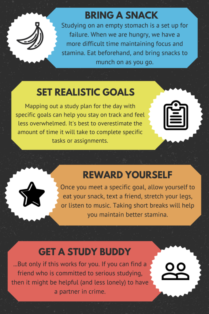
This infographic is about useful studying tips. It is an effective infographic because the information is clear and easy to understand. It is neatly divided into separate colour coded boxes that each have their own image. The images help with the visual aspect and give the reader something to remember each tip by. The colours and images make the infographic visually appealling. It is also very effective to have the step in capital letters (ex. REWARD YOURSELF), and what is underneath in lowercase. This way, even if the reader does not read what is underneath, they will still understand the main idea.
Interactive
The link at the bottom is an example of a CBC news interactive called “It happened before.” This is the story of a possible link between a 1970’s unsolved murder case and Bruce McArthur’s arrest in 2018.
This news interactive is effective because it makes the content easier to understand. The situation being described is a very complicated one. However, the interactive has very short sentences that are clear and easy to understand. The background information is sufficient enough for the reader to understand. At the same time, it is not so detailed that it gets boring.
The interative is also designed in an appealing way. The images used are very engaging and make the reader feel like they really are in Toronto. The images are also placed in the right places, making a perfect pattern of text and image.
https://newsinteractives.cbc.ca/longform/toronto-gay-village-killings
Video
A good video uses effective visuals and presents the facts in an engaging way. The video shown below is about the discrimination faced by the US women’s soccer team. They were paid so much less than their male counterparts. This video is effective because it includes voices and opinions from real people who have a say on this issue. There are also many shots of crowds chanting “equal pay!” which makes for some very heartwarming moments. The video also includes a political element as there are tweets from politicians Elizabeth Warren and Kirsten Gillibrand, who both support the US women’s team.
The video explains this topic in a way that someone who did not previously know about this would understand. The background information is sufficient before diving into the hard details. The topic is engaging because of the many voices that are involved.
Visuals can grab a reader’s attention in many ways. As we saw with the three examples, visuals can come in any form. Even though all these visuals were different, they were engaging in their own ways.